Revitalize Athletics: Brand Strategy & Identity Development

Based in the beautiful Rocky Mountains of Colorado, Revitalize Athletics is a mobile physical therapy service dedicated to providing clients with 24/7 top-tier care. Their mission is to build a healthier tomorrow for Colorado’s outdoor enthusiasts by delivering comprehensive, accessible, and quality rehabilitation without the constraints of the traditional profit-driven insurance model. Visit their website here to check out their services!
I helped launch this brand in 2022, providing the in-depth brand strategy and design services necessary for establishing a strong, impactful identity.
Building the Brand
To bring my client’s vision to life, I begin most branding projects by creating moodboards. This process helps establish a shared creative direction and path toward success. The two visual concepts below have distinct personalities, rooted in Jungian archetypes.
Using the moodboards below as a foundation, we established that the Explorer archetype was most effective for the brand’s core personality, but retained some influences of the Hero archetype (such as its drive for self-improvement) in order to maintain a unique archetypal mix.

The Explorer: Driven by adventure, freedom, and discovery, this personality usually loves the outdoors. Our service promises these clients freedom; overcoming the confines of injury to return to adventure.

The Hero: Driven by ambition, independence, and growth, this personality seeks to achieve mastery in its pursuits. Our service promises these clients the tools and motivation necessary to achieve their goals.
Logo Concepts

Sketches
Adhering to the design criteria and brand personality agreed upon with my client, I began sketching six different logo concepts. The criteria included expected design best-practices (such as scalability and versatility), with the added goal of using the business initials “RA” within the design. The top two concepts are shown below.

Concept: The initials emerge from the mountain in this design. This logo is clean and modern, with the mountain clearly referencing the company’s Homebase of Colorado. Its energy conveys strength and structure, reinforcing the idea of athleticism.

Concept: A branch of Bay Laurel overlays the initials in this design, symbolizing victory and triumph. In the past, heroes were given wreaths made of laurel leaves— it’s also used in the Olympics for these reasons. This logo is uplifting yet soft, focusing heavily on the idea of wellness.
Visual Brand Identity
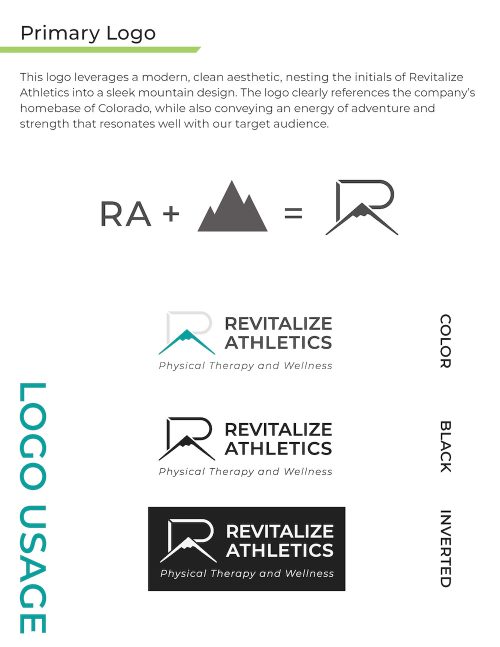
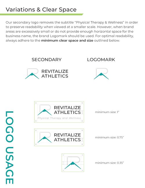
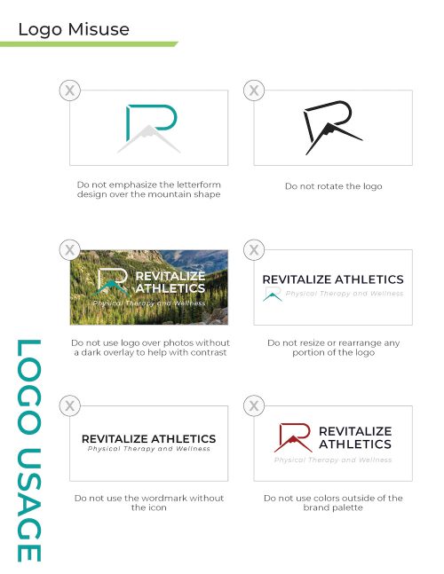
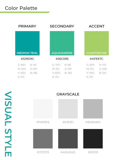
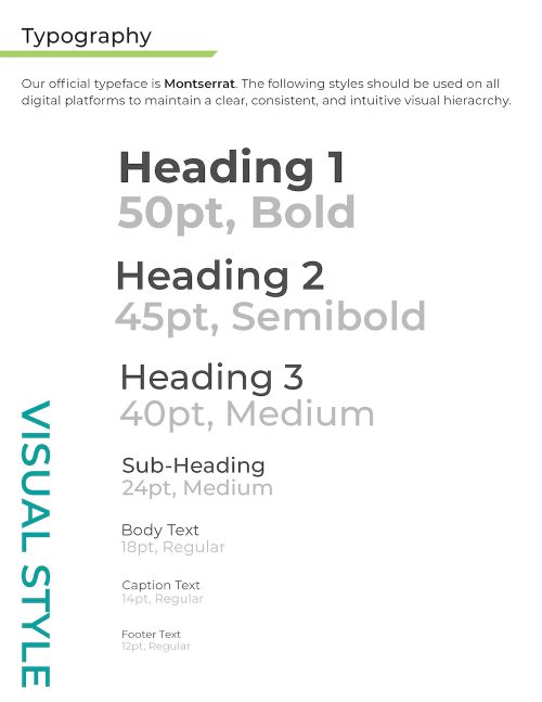
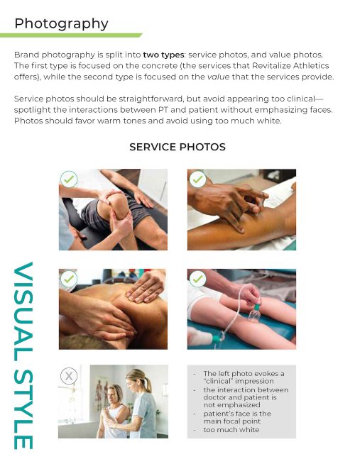
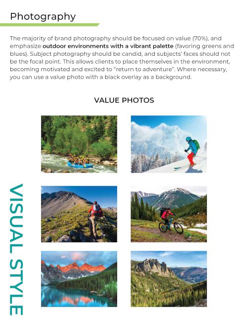
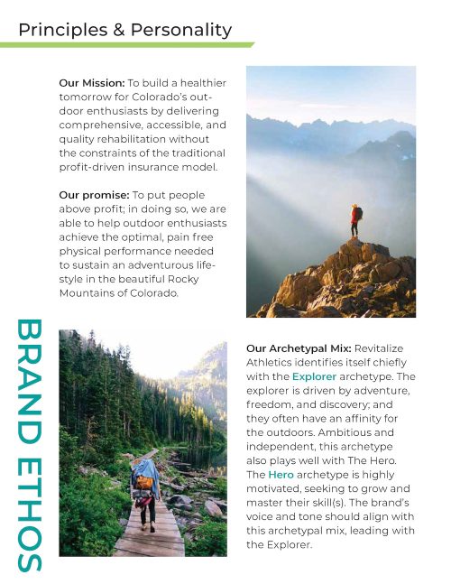
The above guide builds upon the strong foundation my client and I created together, offering direction on three key aspects of the brand: Logo Usage, Visual Style, and Brand Ethos. These guidelines ensure proper logo, color, and type usage, while also outlining what constitutes on-brand photography and messaging.